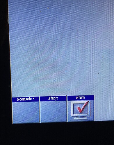
Those are way the icons are minimized in AfterStep Classic, I don’t think its possible in current versions of FVWM.
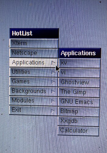
This is how the root menu is done, this will be a challenge.
AfterStep Classic 1.1b4 has been released!
Most of this release’s changes were done to bring AfterStep Classic 1.1b4 to feature parity with 1.1b2.
- This release includes a config file in the format used in Fvwm3 1.0. Fvwm2rc still updated.
- The Wharf is resized so that the old AfterStep Classic tiles work, it looks like 1.1b2 now.
- The Wharf rolls up now, press the AfterStep button to roll/unroll the Wharf. Thanks Fvwm Forum user Rasat for this!
- Root menu remaned to “Hotlist”, as it was done in 1.1b2. More work remains to be done on the root menu.
- Iconify/Uniconify icons uses the Zoom effect, like in 1.1b2.
- Cleaned up the config files, simplified some syntax.
Nice update, clean, and simple base to build upon.
If aim is to have one-click for the menu, buttons and functions, this mouse binding does the deiconify with one-click. Currently, it requires double-click to deiconify an iconified application icon.
Mouse Binding (one-click deiconify):
Mouse 1 I A Iconify off
That’s not a bug, its a feature. Its actually how AfterStep Classic works.
That’s a surprise. Double-click came from Apple Computer (1983) and adapted by Windows. In AfterStep 2.2 it is one-click.
What’s the difference between 1.1b4 and 1.1b2?
Differences?
1.1b2 was based on Fvwm 1.x, b4 is based on Fvwm 2.6.x
b4 lacks the ability to pack minimized icons close together, which is a limitation of Fvwm.
b4’s minimized icon titles are on the bottom, whereas b2’s were on top, another limitation of Fvwm.
b4 doesn’t have the gradients b2 had, I have no idea how to translate Fvwm 1.x gradients to the current Fvwm.
b4’s root menu doesn’t look like b2’s but I’m working on it for the next release.
b4 does have a feature b2 doesn’t have: you can roll up the Wharf by clicking the AfterStep icon in the Wharf,
Do you mean the gradient color setting? Does this help…
Colorsets for Diagonal, Horizontal and Vertical buttons.
Gradient directions:
Diagonal = D
Horizontal = H
Vertical = V
### GREY (examples)
Colorset 16 VGradient 50 #646464 #b6b6b6
Colorset 17 HGradient 50 #646464 #b6b6b6
Colorset 18 DGradient 50 #646464 #b6b6b6
No, I mean how to translate the gradients from Fvwm 1.x to current. When I get home I’ll post how they were in b2.
True, I tried different option combinations, but the gap remains. For example:
Style * IconBox 0 -20 -0 -0, IconGrid 0 0, IconFill left bottom

Maybe, because the last two geometry options don’t work.
Style * IconBox 0 -10 -280 -1
b4’s minimized icon titles are on the bottom, whereas b2’s were on top
You can remove the title, looks better.
Style * NoIconTitle
Here is how the gradients are set up in AfterStep Classic 1.b2, if someone wants to try to translate these to modern Fvwm.
# Set Gradient Texture Mapping
# Define the texture type for the TitleBars, unfocused TitleBars,
# Menu TitleBars, Menu Items, etc.
#   0 - No texture
#   1 - Wharf-style gradient
#   2 - Horizontal one way gradient
#   3 - Horizontal from top/bottom to center
#   4 - Vertical one way gradient from left to right
#   5 - Vertical from left/right to center
# 128 - User specified pixmap
TextureTypes 1 1 1 1 1 0

# Set the number of colors to use on textures.
# Default is 10 on 8bpp screens and 128 on +16bpp.
TextureMaxColors 10 10 10 10

# Texture Colors, given in Standard RGB X numbering
# Window TitleBar textures
TitleTextureColor	#303080	#000010
# Unfocused TitleBar textures
UTitleTextureColor	#a0a2a1	#606261
# Menu TitleBar textures
MTitleTextureColor	#303080	#000010
# Menu Item textures
MenuTextureColor	#606060	#d0d0d0
Should be quite easy with Colorsets D, H and V, similar to menu: 2, 3, and 4. Also menu 128 with Pixmaps. Wharf-style gradient maybe not, gradient through all icon buttons.
Post a few screenshots of menu 2 and 3, if it looks different with Colorsets.
I also installed the Debian AfterStep 2.2 to have a look at what’s there. As you said, it is slow and has a poor response. But the features and modules are nice. It’s great that @PrisonGuy makes it in Fvwm.
It would be good to add some of the modules, for example: pager which is in the right-upper corner, and the taskbar.
The iconified apps in the left-bottom corner look good and the title bar. If this could be fixed in Fvwm.
Hi! This is the greatest news for me. I have been using “asclassic” on Debian/GNU Linux for more than 20 years by compiling it from the source code. Thanks a lot.


